|
Getting your Trinity Audio player ready...
|
Every year the fashion and trend industry of Australia publishes a colour palette for the upcoming season. The colour combinations palette became the anchor point for fashion designers, market trends and t shirt printing businesses to follow. They suggested the fashion colours for 2023 to prioritise few colours over others for their personal wardrobe.
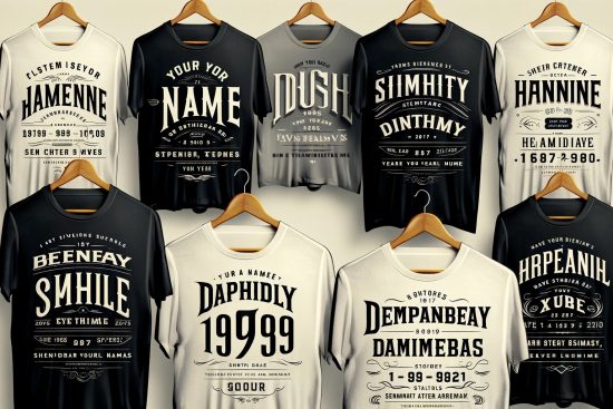
This article will explain the best combinations of colours in 2023 if you design your t shirt and need help to make it right.
How The Color Combinations Are Derived?
It is essential to understand the types of colours and what their impact is on you. So let’s look at the colour wheel first before we jump on to making an effective combination of colours.
The colours have a great impact on the human mood. There are three categories of colours. The first one is called the primary colours.

Types Of Colours
Primary Colours
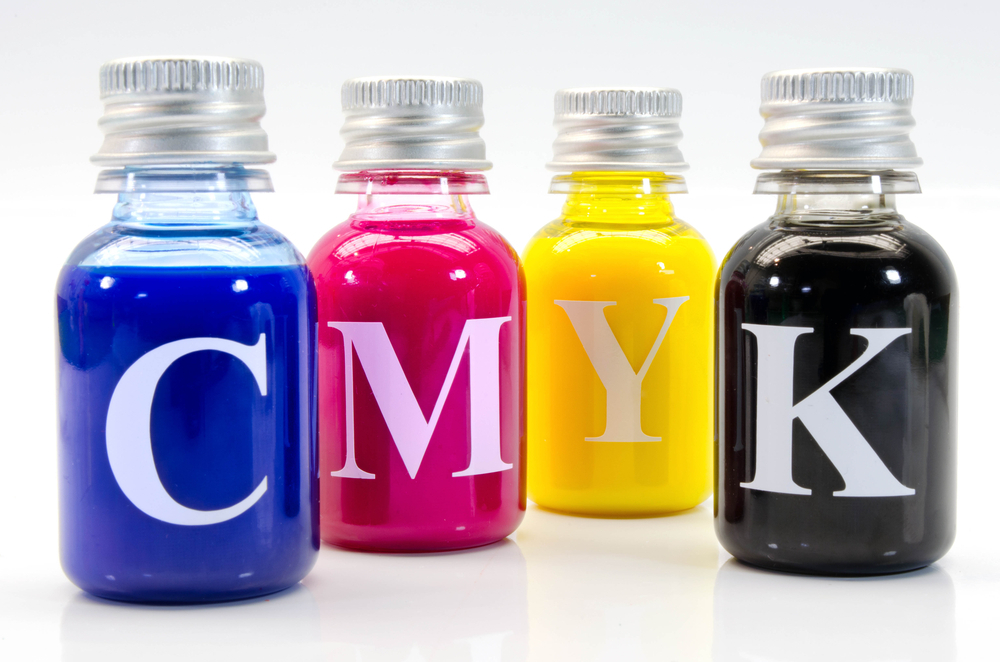
The primary colours are the three colours from which all the rest of the colours can be derived. They are red, yellow and blue. You can see it on the given colour wheel photo above. The two primary colours then mix in a particular proportion to make the secondary colours.
Secondary Colours
The second tear of colours are Orange, Violet and Green and are called secondary colours. Therefore, it can be called the second generation of the colour family.
Read More: T Shirt Designing Mistakes You Must Avoid!
Tertiary Colours
The tertiary is made again with the proportionate mix of primary and secondary colours, and they extend the third generation with six variable hues. Hence, they are called tertiary colours.
Warm & Cool Colours
Once the colour palette is complete, you can observe the feel and outlook of the colours. There are warm colours mixed with yellow, red which are vibrant and sharp. And there are cool colours which are hues of blue-green mix and look more astonishing to eyes.
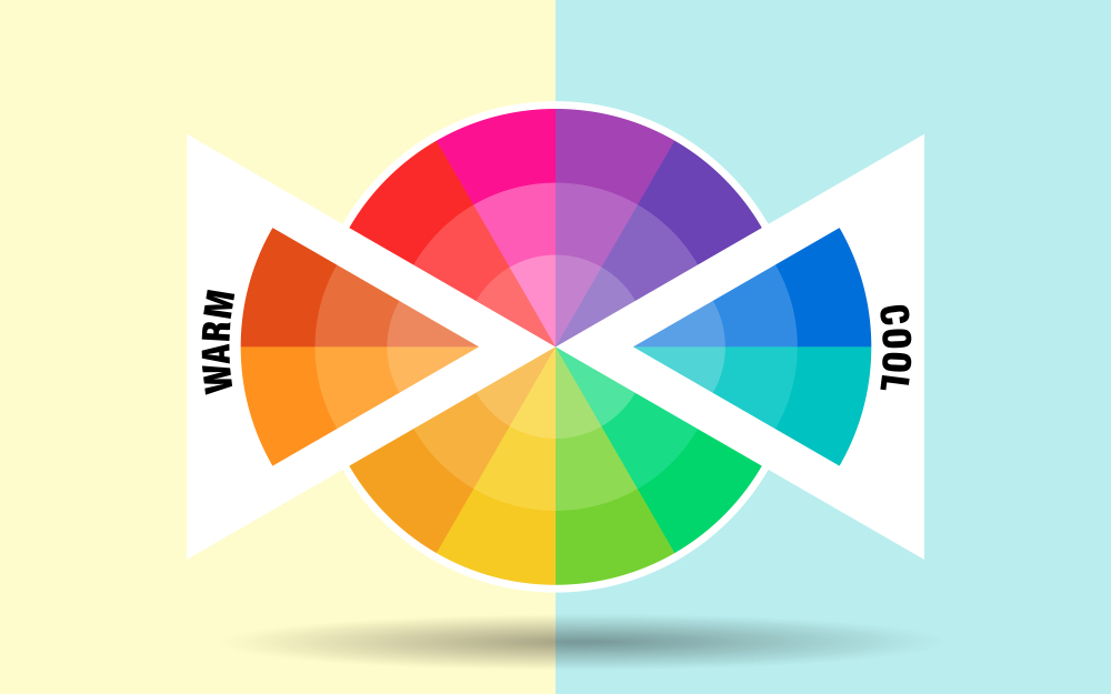
Complimentary Colours
The complementary colours are the opposite colours placed on the wheel where we know that the one side is the warm colours, and the exact opposite is known as the cool colour palette. When we use these opposite existing colours in high saturation, they create a stark contrast. So the tip is to keep one colour in the main focus and use the opposite in variable value to create a harmony subtly.
Colour Combinations For T Shirt Printing 2023
It is said that colour is an art and science that impacts every person who is carrying it and to whom who is observing it. It won’t be wrong to say that colours communicate.
Also Read: T-Shirt Printing Methods
Our selection of good colour combinations does matter in projecting our personality to our social circle. Let’s explore the best colour combinations according to the colour forecast if you plan to get your custom t shirt printing for your summer wardrobe.
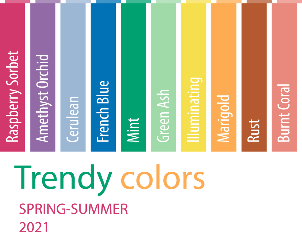
Here we share the fashion colour palette and the colour trending this summer in Australia. First, you need to understand one crucial rule of picking one colour as the base of your t shirt. Then we will select another colour that will be essentially from the other side of the colour family called complementary. This will ensure that the print on the coloured t shirt will be visible and is of the correct value, which can create a successful combination.

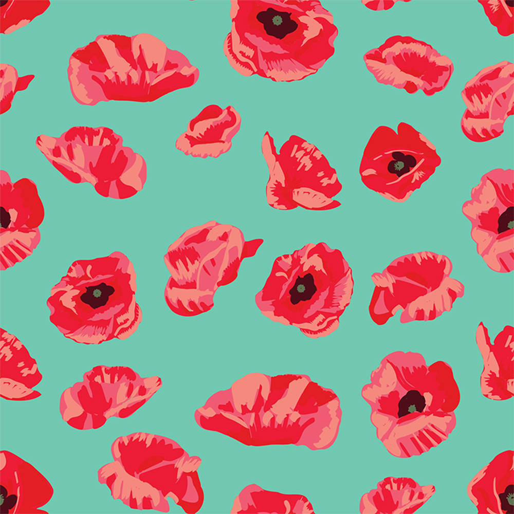
Raspberry Sorbet & French Blue
Both the colours raspberry Sorbet and French blue are on the fashion colour list. They are perfect complementary colours with the most appropriate tone, which look very pleasant together. You can improvise by shifting the base colour to the print on the t shirt, though the impact will shift from the feel cool to the bright and subtle.
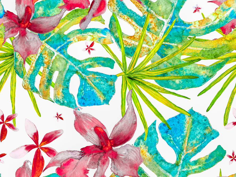
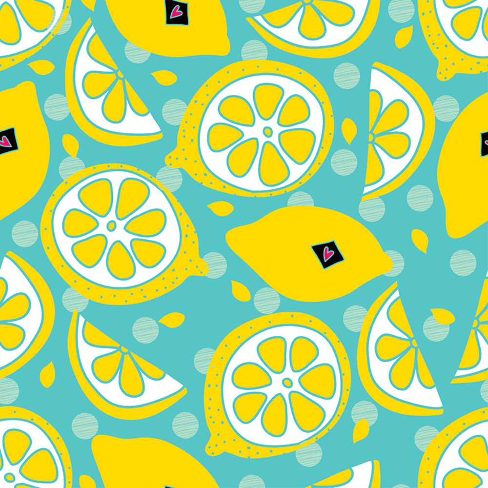
Blue Cerulean, Burnt Coral & Illuminating
The tint and tones of cerulean blue are the coolest of the colour family, and it is the best summer choice to get a t shirt base colour. Try the print on with burnt coral and illuminating pale yellow. They are from a warm family but are in very subtle tones and create a harmonious overlapping of cool summery colours.
Read More: How To Tie Dye A Shirt – Update
The photo below has the reference print image that can be printed directly to the t shirt or used as the colour combination in some other pattern.
Marigold, Rust And Orchid Combinations
The marigold and rust are the colours of the warm side of the family, but the fashion tones are very subliminal yet have a characteristic that shows brightness. Therefore, it is highly recommended to use navy blue or darker shades of violet as a base fabric colour of the t shirt. The Amethyst Orchid will balance the coolness of the print in reverse.
Mint & Illuminating Lime
The base of the t shirt is a mix of mint aqua with a fun summer print of illuminating lime. One can not find a better t shirt colour combination than this for summer 2023. It is rightly cool and bright for young girls and guys to have hangouts on their beach days.
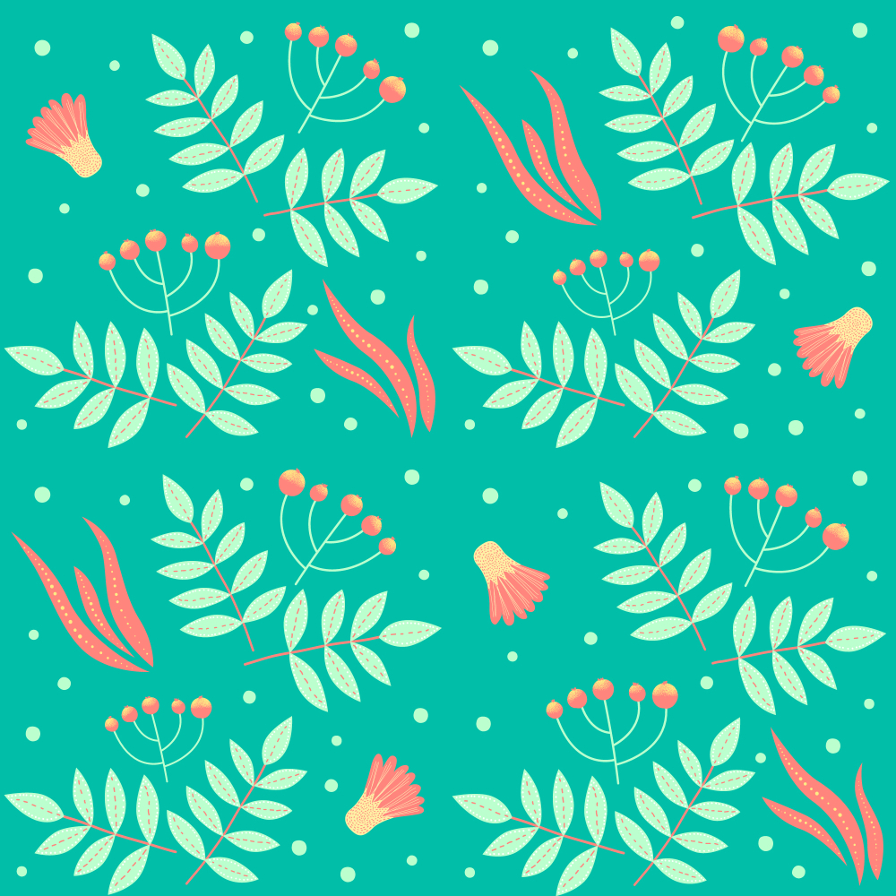
Green Ash & Coral
The shades and tones of green ash hue are trendy as per the forecast of summer fashion update 2023.
Read More: 5 Summer T Shirts Style Australia 2023/24
It is a member of the cooler colour side of the family and humbly interacts with most of the warm side family members. The selection of print for the t shirt should not be very dense and has a sprinkle of sharp coral tint. It is a delightful combination to have, especially for the fabulous ladies.
Wrapping Up
The article informs you about making the correct colour combinations according to the fashion trends of 2023. We elaborate on various colours and the hierarchy of primary, secondary and tertiary colours divided into warm and cool colour sides of the colour family. Finally, we suggest the colour combinations for t-shirt printing that work the best if you design your custom t-shirt and need advice on the colour combination.
Images Source: Shutterstock
Also Read:
- How Do You Make A Stencil For A T Shirt
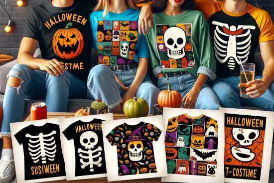
- Halloween Costume T Shirts Ideas
- Smart Casual Wear Fashion
- How To Do DIY T shirt Printing